-40%
WWI Poster 1918 "To Make the World a Decent Place...Liberty Loan" HERBERT PAUS
$ 250.79
- Description
- Size Guide
Description
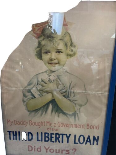
WWI ORIGINAL"Third Liberty Loan"
Poster by
HERBERT ANDREW PAUS.
Huge, 36" x 56"
The stunning lithography was done by the
"
NIAGARA LITHO CO."
of Buffalo, New York, 1918.
Text reads, in large type 3" and 2" in height,
"TO MAKE THE WORLD /
A DECENT PLACE TO LIVE IN /
DO YOUR PART - BUY U.S. GOVERNMENT BONDS /
THIRD LIBERTY LOAN"
Archival restoration work was done on this by a professional conservator here in Little Rock who formerly was with the
Library of Congress.
It has been de-acidified.
Colors are bright and unfaded
.
No stains! Lost paper was replaced with acid free white paper, and tears professionally repaired according to conservation/restoration standards
. This is still a fragile piece of 103-year-old paper and will be shipped carefully rolled.
This hyper-patriotic
THIRD LIBERTY LOAN
Poster was released concurrent with the LOAN's offering on April 6, 1918, the first anniversay of the American declaration of war. The
A.E.F.
and its
U.S.M.C.
contingent were proving their mettle at
Chateau-Thierry
and
Bois de Belleau (Belleau
Wood).
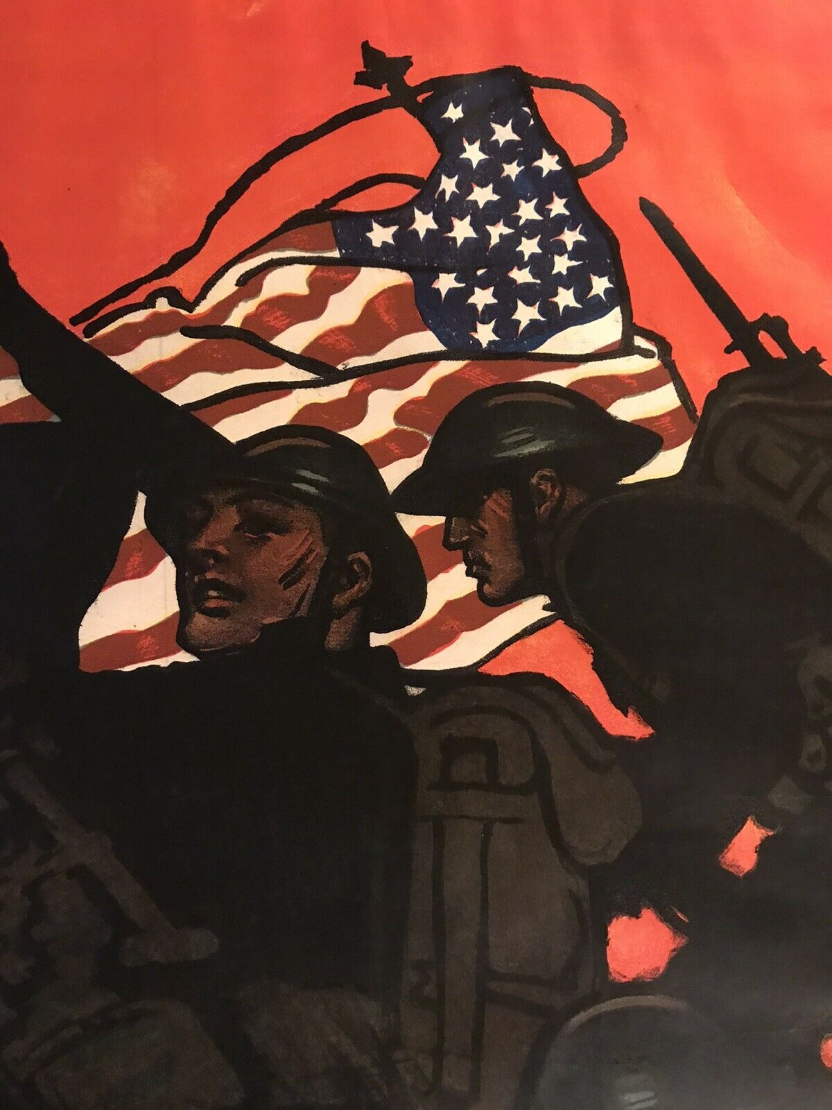
The dynamic image is of ten Doughboys in full
M1910 Web Canvas
battle gear and
M1917 Helmets
, armed with
M1903 Springfields
with
"M1905
B
ayonets-fixed"
silhouetted against a lurid
RED
, cordite-filled sky. A machine gun crew is emplacing a
French Modele 1915 CHAUCHAT 'machine rifle'
at the left of the line.
At the right of the line the unfurled
National Colors
in vivid
RED, WHITE, and BLUE
depicted a full 6 1/2 " in height, towers over the horizontal combat scene!!
The troops are clambering out of a
Front Line Trench
rendered in a ghastly
GRAY
. The border like the shell-churned gray soil, is also a sobering GRAY
.
Paus has rendered the infantrymen's equipment with uncanny accuracy: Entrenching Tools, M1910 Haversacks, Canteens, and Cartridge Belts!
*****
The
T
HIRD LIBERTY LOAN
offered 3 billion dollars. In its one month offering (from April to May 1918), "subscribed and accepted" was 4.17 billion dollars! There were 18,308,325 subscribers! The date of maturity was September 15, 1928. Interest was four and one-quarter percent.
All across the nation enormous Liberty Loan rallies were held with leading stars of the silver screen such as Douglas Fairbanks and Mary Pickford. Six
"WAR
EXHIBITION TRAINS"
with flags, weapons, ordnance, uniforms, war trophies, cannon, portions of a Central Powers submarine criss-crossed the nation, stopping in cities, towns, villages, and hamlets across the midwest, from coast to coast.
*****
HERBERT ANDREW PAUS
Paus was one of hundreds of artists and illustrator who volunteered to work with
THE
DIVISION OF PICTORIAL PUBLICITY
headed by Charles Dana Gibson (the creator of the world famous "Gibson Girl").
The Division of Pictorial Publicity
was made up of 239 artists and 33 cartoonists and had offices in New York City, Chicago, Boston, and San Francisco. Many were previously relatively unknown, but who were to be made famous by their contribution.
*****
Herbert Paus
was a native of Minneapolis and got his first job as a cartoonist for the
St. Paul Pioneer Press
. Ambitious to become an illustrator, he enrolled in the Fine Arts School there, later found employment in a Chicago art studio.
Eventually he moved to New York where he became a free lance illustrator. Paus had a strong sense of design, ideally suited to the many effective posters he painted during World War I. This approach, combined with a striking use of color, was carried over into his magazine illustrations and cover designs.
Herbert Paus was at his most effective depicting subjects that were, in one way or another, larger than life. The work he produced during World War I was essentially a precursor to his stunning advertisements and poster-like magazine covers. The strong visual impact of his more graphic designs was balanced by his ability to wield fine detail in decorative headings for magazine stories and works of fiction for youngsters.
But it was mainly his World War I poster designs that attracted the editorial attention of the mainstream press, including the
New York Herald.
In late December 1919, the Herald published an item on Paus saying, in part: No mere inspiration of the moment, sudden mood, or flitting fancy, but rather true inspiration, aided by deep study and painstaking execution are responsible for the forceful, effective results that he obtains.
By the end of World War I, Paus was already firmly established in the pantheon of successful American illustrators. Indeed, periodicals aimed at commercial artists and those who commissioned them were already singing Paus' praises at least as early as 1912. He was, above all else, a versatile graphic communication ready and able to adjust his approach to the sensibilities of the assignment. He made substantial contributions to several aspects of illustration, from delicate watercolors for children's books to powerful images and striking compositions for posters, and from vibrant art for magazine covers to the creation of comic strips.
While Paus carried a big graphic stick, he was an illustrator who spoke softly. According to one magazine profile, "He is extremely adaptable to any age, but is reserved except when in the company of intimate friends, and it takes time to know and appreciate the exceptional merits of this talented and overly modest artist."
As was the case with many great illustrators of his day, Paus had not only a certain innate ability but also a reliable and strong technique. He was, according to Graphic Arts, a sure and thorough draftsman, with "a fine sense of color and a maker of absolutely practical advertising pictures in a truly artistic manner."
With that talent and the resulting popularity he was afforded the luxury of choosing assignments that suited him. Paus continued to build his reputation, finding it "conducive to be able to select such commissions as are most interesting and best-suited to his qualifications." He showed a level of commitment to his advertising work that was in many respects, at the vanguard of the changing look of advertisements—in stark contrast to the ads turned out by the studio. He believed that "as much art belongs in advertising design as in a magazine cover, and he puts it there with the keen graphic touch, appreciation for color, and sense of correct values that are possessions of his and few others."
Pause would immerse himself in attention to detail, far beyond careful reading of the manuscript. His covers for
Popular Science
showed that he was well versed enough in the cutting edge of science to provide a viable and artistic representation of scientific advances. His designs became closely associated with
Popular Science
, and he produced all their covers from mid-1927 to early 1931.
Even during this period, Paus was readily adaptable and far from a slave to the technical constraints associated with the magazine. In the series "Notable American Illustrators,"
Walker Engraving Company
spotlighted Paus
"because his color is as daring as the scale of his monumental figures. (Daring—but beautifully arranged.)" His colors were "daring" to the point of being truly vibrant. Such vivd colors were achieved by his manipulation of traditional media, allowing for a concentration of the pigment that made his color choices stand out.
Paus wore a visor while working to keep ambient light from diffusing his perception of the color he had just laid down—and as an aid to keep him focused at the task at hand.
For subjects involving single figures, he would usually work directly from life, often posing his wife from whom, according to a story in
Redbook
in January 1929, "the wearing and draping of clothes amounts to an art."
By the tender age of seven, Herbert was already showing artistic interest and ability. His parents encouraged the youngster's budding talent, sending him for half the day each Saturday to house of local (St. Paul, Minnesota) artist Burt Harwood, where Herbert and several other boys learned about things artistic. Harwood had studied in Europe and he was eccentric enough to capture the kids' imaginations. Every Saturday it was as though the boys had stepped into another world. It was in this secluded, yet invigorating atmosphere that Paus began to thrive artistically. When the Paus family left Sr. Paul for the Puget Sound area of Washington State, Herbert—then eleven years old—continued study with his mentor, spending three of the next five summer studying with Harwood.
When Paus was sixteen, he was in search of a job. Through the influence of Harwood, Paus landed a job at the
St. Paul Pioneer Press
newspaper. At the time, R.F. Outcault's
"Yellow Kid"
was forever changing the relationship between newspaper and illustration. The
Pioneer Press'
editorial cartoonist left the paper and Paus, who had shown a proclivity toward editorial and humorous drawing, took over as staff cartoonist.
After about two years, however, according to
Graphic Arts
, Paus "decided that art and journalism were not yet reconciled to each other and joined the
Binner Engraving
Company
of Chicago., which was just discovering commercial illustration." Shortly after Paus moved to Chicago,
Binner
decided that a New York office would be of prime importance to assure the company's growth. The new York office opened in 1899 with the 19-year old Paus on staff. When he wasn't at
Binne
r, Paus was refining his abilities at classes at the
Chase School of Ar
t with legendary instructors Robert Henri, George Bridgeman and F.V. DuMond.
By 1902, Paus made another change, deciding that freelance illustration, with its relative artistic freedom and flexibility, was the best path to follow. His early clients included
The Ladies' Home Journal, Life, Delineator, Pictorial Review, St. Nicholas and The Associated Sunday Magazin
e. In this period, Paus also created theatrical set designs for a variety of productions. He had become a hard-working, successful illustrator—and one whose work was about to become immensely popular by virtue of events that were beyond his control.
The United States entrance into World War I brought a pressing need for professionally produced artwork to produce citizenry.
The Division of Pictorial Publicity
shouldered much of the responsibility for choosing and directing the most talented artists. Paus was among the first recruited to lend a hand.
He was committed to doing whatever he could for the war effort
. The New York Tribune's
1919 profile lauds the "willingness and promptness with which he gave his services unrewarded..."
Paus created boldly heroic inspirational images that communicated the message effectively. Through a masterful combination of bright colors, strong composition, and quality technique, the intent in Paus' poster designs was always clear, urging Americans to join up for service overseas as well as for projects closer to home (such as the Women's Land Army) , to save money with War Savings Stamps, and to work harder because "York work is an important factor in the fight for freedom."
His style had become so recognizable through omnipresent posters that demand for his work in other areas of illustration grew. For instance, during the war years, Paus created many covers for
Collier's
, a weekly that devoted much space to battle reports. During the week of March 10th, 1917, the circulation of
Collier's
surpassed a million; the impact of the cover art certainly played a goal in the reaching of this milepost.
The 1919
New York Tribune
article referred to earlier lists Paus' hobbies as designing and building furniture in the summer and playing billiards in the winter—activities that require precision, craftsmanship, foresight and patience. Likewise, these characters continually show themselves in Paus' illustration work.
Many contemporary sources on Paus' work say he preferred craftsmanship over decoration. The two, decoration and craftsmanship, are no longer to be considered mutually exclusive. It was the craftsmanship of the decoration that Paus seemed to have found most rewarding—the methodical yet sure journey toward an ideal image of compositions that convey universal truths.
In keeping with the idea that as much art belonged in an advertisement as in a magazine cover, Paus believed advertising and decoration to be closely related. In looking at this advertising images, it's apparent that what's being sold is the idea of the product rather than the product itself—he's bringing to life the seed of the viewer's ideas of what the product can do for them, not simply telling the viewers a story about the product. Over 50 years after his death, the broad imaginative appeal of Paus' artwork remains are fresh to the eye today
*****
Herbert Paus
(1860 - 1944)
Jim Steranko says Paus' use of color makes him "The Bob Peak of his age," Primarily a watercolorist, Paus used oils on occasion, notably for
Hart Shaffner and Marx
. He was also expert at pencils and inks. Poster and story artist for
The Delineator
by 1903, followed with large posters for
Bond Bread, The Victor Company,
and US Government in WWI. Ad work for
Willy's Overland, American Radiator, Hart Schaffner and Marx, A & P, Certain-teed.
Covers and interiors for:
Pictorial
Review
,
Collier's, Liberty, Ladies' Home Journal, American Magazine, Life, Woman's Home Companion, Popular Science, Country Life,
as well as several books.
"I love this guy's work - the way he outlines the figures with a thick black line. Almost makes you wish they'd never invented photography."
James Lileks, commenting on an American story illustrated by Paus
*****
